一款适用于独特且可自定义 SwipeAction 的 SwiftUI 库
FxSwipeAction
一个专门用于独特且可自定义的滑动操作的 SwiftUI 库
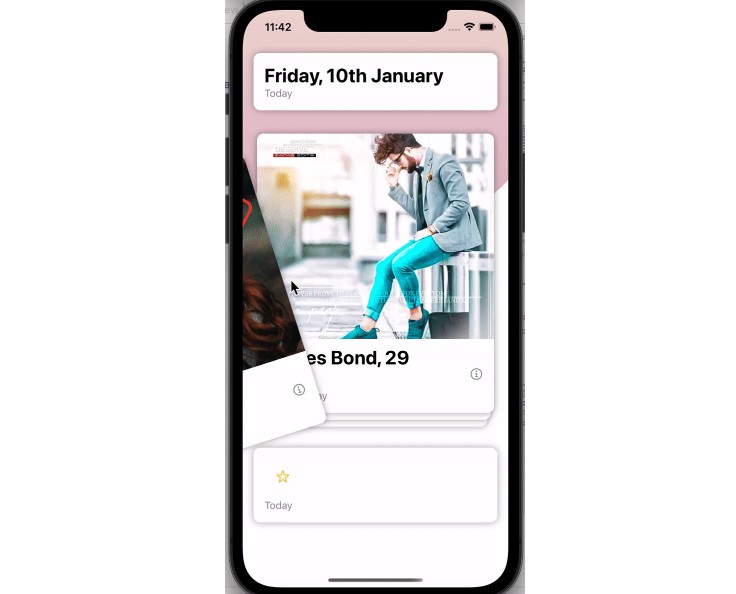
FxSwipeAction 是一个 SwiftUI 库,它使开发者能够轻松地将滑动操作添加到 SwiftUI 视图。凭借其简单的集成和丰富的自定义选项,它通过提供直观且响应迅速的滑动界面来增强用户互动。功能
- 通用:对包括 List 和 VStack 在内的任何 SwiftUI 视图启用滑动操作。
- 图标支持:在滑动操作中添加自定义图标或 SF 符号,以实现更直观的界面。
- 完全可自定义:调整滑动操作的外观以匹配您应用的设计。
- 智能交互:在 FXSwipeViewGroup 中与其他项目交互时,滑动操作会自动关闭。
用法
步骤 1:导入FxSwipeAction
import FxSwipeAction
步骤 2:添加fxSwipeActions
向您的视图添加滑动操作。您可以在前部或尾部添加一个操作,也可以同时在两个方向添加。为了确保获得独特且用户友好的体验,建议每侧仅使用一个操作。
重要提示:在fxSwipeActions之后添加一个帧高度。该库使用GeometryReader来确定其大小,因此在之前设置帧可能无法按预期工作。
CarwView()
.fxSwipeActions(
    leading: FXSwipeActionButton(
        iconType: .system("checkmark.circle.fill"),
        type: .leading,
        action: {
            // Your action here
        },
        tint: .green
    ),
    trailing: FXSwipeActionButton(
        iconType: .system("trash.fill"),
        type: .trailing,
        action: {
            // Your action here
        },
        tint: .red
    )
)
// Remember to set the frame height
.frame(height: 80)
步骤 3:自定义(可选)
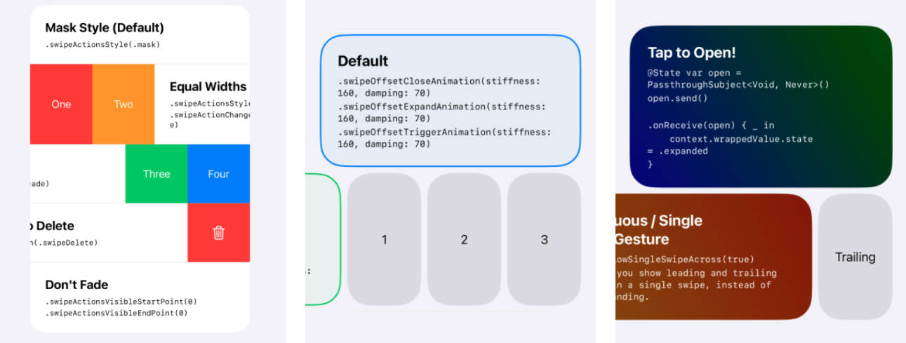
使用fxSwipeActionsStyle修饰符自定义滑动操作的外观和风格。此功能提供了广泛的自定义选项,允许微调滑动操作和内容的外观以匹配您应用的设计语言。以下是对自定义选项的分解:
// fxSwipeActions ...
.fxSwipeActionsStyle(
    main: .init(
        cornerRadius: 20, // Rounds the corners of the swipe action button
        swipeSpacing: 0,  // Sets the space between the content and the swipe action button
        padding: 12       // Determines the padding at the top and bottom of the swipe action
    ),
    shadow: .init(
        shadowColor: .gray.opacity(0.2),  // Sets the color and opacity of the shadow
        shadowRadius: 8,                  // Determines the blur radius of the shadow
        shadowOffset: CGSize(width: 0, height: 10) // Sets the offset of the shadow
    ),
    style: .init(
        fontColor: .white,   // Changes the color of the text in the swipe action
        fontSize: 20,        // Sets the size of the text in the swipe action
        iconColor: .white,   // Alters the color of the icon in the swipe action
        backgroundColor: .white // Applies to the background of the content, not the swipe action
    )
)
自定义选项说明:
cornerRadius:这会修改滑动操作按钮的边角圆度。
swipeSpacing:调整您的内容和滑动操作按钮之间的间隙。
padding:设置滑动操作区域的顶部和底部填充,确保它紧密地适合您的布局。
shadowColor、shadowRadius、shadowOffset:这些属性允许您为滑动操作按钮添加和自定义阴影效果,赋予它深度和突出性。
fontColor、fontSize:这些设置控制滑动操作中文本的外观,让您匹配它和您的应用的字体。
iconColor:更改滑动操作中使用的图标颜色,以便于更好地观看或与您的应用配色方案保持一致。
backgroundColor:与其他属性不同的是,它设置了滑动操作所应用的内容的背景颜色,而不是滑动操作本身。这对于保持您的内容的一致外观很有用。
步骤 4:用于与 VStsck 一起使用
如果您将它与 VStack 一起使用,则您必须在fxSwipeActions之后添加.padding(.horizontal)以进行适当的对齐。
步骤 5:FXSwipeViewGroup(可选)
要确保在一组视图中同一时间只有一个滑动操作处于活动状态,请用FXSwipeViewGroup包装您的整个视图层次结构。这在存在多个可滑动项目以及您想防止同时打开多个项目的情况下特别有用。
当FXSwipeViewGroup被使用时,它管理跨所有子视图的滑动状态。只要在某个项目上启动滑动操作,在其他项目上先前打开的任何滑动操作都将自动关闭。这有助于保持一个干净且用户友好的界面。
示例用法:
用FXSwipeViewGroup包装您的视图,例如NavigationStack或一个项目列表。根据需要,在该组内的各个项目中添加.fxSwipeActions()修饰符。
FXSwipeViewGroup {
    NavigationStack {
        // Your content here...
        // For example, a card view with swipe actions
        .fxSwipeActions()
    }
}
安装
Swift 包管理器
dependencies: [
    .package(url: "https://github.com/X901/FXSwipeAction.git")
]
要求
- iOS 15+
- Xcode 13+