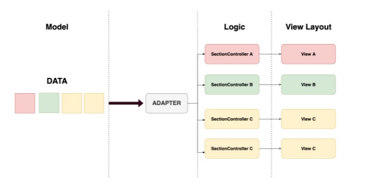
一个 SwiftUI 库,允许您在 ScrollView SwiftUI 组件中添加本机或自定义节样式
滚动视图部分套件
一个 SwiftUI 库,允许您在 SwiftUI 组件中添加本机(、、)或自定义节样式。plaingroupedinsetGroupedScrollView

概述
- 💎 由100%SwiftUI制成。
- 🚀 轻量级,无外部依赖。
- ✅ 该 API 尝试模仿 Apple 的组件,但您可以在组件中使用它。
ListScrollView - 🎨 预定义的 和剖面样式,但您也可以定义完全自定义的剖面样式。
.plain.grouped.insetGrouped - 🧪 在多个生产应用中进行测试。
- 📑 文档齐全的 API。
要求
- iOS 14.0+
- watchOS 7.0+
- 电视操作系统 14.0+
- macOS 11.0+
Installation
Swift Package Manager
The is available via the Swift Package Manager.ScrollViewSectionKit
https://github.com/pavolkmet/ScrollViewSectionKit
CocoaPods
The is available through CocoaPods. To install
it, simply add the following line to your Podfile:ScrollViewSectionKit
pod 'ScrollViewSectionKit'
Then just run .pod install
Manually
Just drag and drop all files from folder in the into your project and select .SourceScrollViewSectionKitCopy items if needed
Usage
import ScrollViewSectionKit

struct ContentView: View {

    var body: some View {
        ScrollView {
            VStack(spacing: 0.0) {
                ScrollViewSection {
                    Text("This is a 1st row.")
                    Text("This is a 2nd row.")
                } header: {
                    Text("Section header".uppercased())
                } footer: {
                    Text("Section footer")
                }
            }
        }
        .scrollViewSectionStyle(.insetGrouped)
        .scrollViewSectionBackgroundColor(.clear)
        .background {
            Color(uiColor: UIColor.systemGroupedBackground)
                .ignoresSafeArea()
        }
    }

}
See example application for all examples and advanced usage.
Configuration
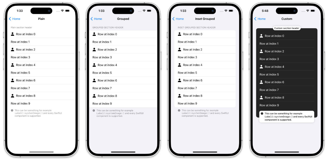
Section – Style
You can customize the appearance of section by applying different styles using the modifier. This modifier can be used globally or per section. The library already contains the , and styles.scrollViewSectionStyle(_ style: any ScrollViewSectionStyle).plain.grouped.insetGrouped
In the following example the first uses the style because it is set as part of the component but the second uses style. This is because under the hood the modifier is using . This means that you can use this modifier to set a global style for the entire application.ScrollViewSection.groupedScrollViewScrollViewSection.insetGroupedscrollViewSectionStyle(_ style: any ScrollViewSectionStyle)EnvironmentKey
import ScrollViewSectionKit

struct ContentView: View {

    var body: some View {
        ScrollView {
            VStack(spacing: 0.0) {
                ScrollViewSection {
                    Text("This is a 1st row.")
                    Text("This is a 2nd row.")
                } header: {
                    Text("Section header".uppercased())
                } footer: {
                    Text("Section footer")
                }
                .scrollViewSectionStyle(.insetGrouped)
            }
        }
        .scrollViewSectionStyle(.grouped)
        .scrollViewSectionBackgroundColor(.clear)
        .background {
            Color(uiColor: UIColor.systemGroupedBackground)
                .ignoresSafeArea()
        }
    }
}
It should look like this ⬇️

Section – Background Color
You can customize the appearance of section by applying different background colors using the modifier. This modifier can be used globally or per section.scrollViewSectionBackgroundColor(_ color: Color)
In the following example the first uses the background color because it is set as part of the component but the second uses background color. This is because under the hood the modifier is using . This means that you can use this modifier to set a global style for the entire application.ScrollViewSection.blue.opacity(0.28)ScrollViewScrollViewSection.orange.opacity(0.28)scrollViewSectionBackgroundColor(_ color: Color)EnvironmentKey
import ScrollViewSectionKit

struct ContentView: View {

    var body: some View {
        ScrollView {
            VStack(spacing: 0.0) {
                ScrollViewSection {
                    Text("This is a 1st row.")
                    Text("This is a 2nd row.")
                } header: {
                    Text("Section header".uppercased())
                } footer: {
                    Text("Section footer")
                }
                ScrollViewSection {
                    Text("This is a 1st row.")
                    Text("This is a 2nd row.")
                } header: {
                    Text("Section header".uppercased())
                } footer: {
                    Text("Section footer")
                }
                .scrollViewSectionStyle(.insetGrouped)
                .scrollViewSectionBackgroundColor(.orange.opacity(0.28))
            }
        }
        .scrollViewSectionStyle(.grouped)
        .scrollViewSectionBackgroundColor(.blue.opacity(0.28))
        .background {
            Color(uiColor: UIColor.systemGroupedBackground)
                .ignoresSafeArea()
        }
    }
}
It should look like this ⬇️

Row – Background Color
You can customize the appearance of row by applying different background colors using the modifier. This modifier can be used per section or per row.scrollViewRowBackgroundColor(_ color: Color)
In the following example the second row of the first section uses the background color because it is set as part of row. The first row of the second section, on the other hand, uses background color because the entire section uses this modifier and the last row of the second section uses the background color..blue.opacity(0.28).green.opacity(0.28).orange.opacity(0.28)
import ScrollViewSectionKit

struct ContentView: View {

    var body: some View {
        ScrollView {
            VStack(spacing: 0.0) {
                ScrollViewSection {
                    Text("This is a 1st row.")
                    Text("This is a 2nd row.")
                        .scrollViewRowBackgroundColor(.blue.opacity(0.28))
                } header: {
                    Text("Section header".uppercased())
                } footer: {
                    Text("Section footer")
                }
                ScrollViewSection {
                    Text("This is a 1st row.")
                    Text("This is a 2nd row.")
                        .scrollViewRowBackgroundColor(.orange.opacity(0.28))
                } header: {
                    Text("Section header".uppercased())
                } footer: {
                    Text("Section footer")
                }
                .scrollViewSectionStyle(.insetGrouped)
                .scrollViewRowBackgroundColor(.green.opacity(0.28))
            }
        }
        .scrollViewSectionStyle(.grouped)
        .scrollViewSectionBackgroundColor(.clear)
        .background {
            Color(uiColor: UIColor.systemGroupedBackground)
                .ignoresSafeArea()
        }
    }
}
It should look like this ⬇️

Row – Insets
You can also customize the appearance of row by applying different row insets using the modifier. This modifier can be used per section or per row.scrollViewRowInsets(_ insets: EdgeInsets?)
In the following example the whole first section uses row insets because the entire section uses this modifier. The first row of the second section, on the other hand, uses row insets because just this one row uses this modifier and the last row uses default row insets.EdgeInsets(top: 0.0, leading: 40.0, bottom: 0.0, trailing: 0.0)EdgeInsets(top: 0.0, leading: 40.0, bottom: 0.0, trailing: 0.0)
import ScrollViewSectionKit

struct ContentView: View {

    var body: some View {
        ScrollView {
            VStack(spacing: 0.0) {
                ScrollViewSection {
                    Text("This is a 1st row.")
                    Text("This is a 2nd row.")
                } header: {
                    Text("Section header".uppercased())
                } footer: {
                    Text("Section footer")
                }
                .scrollViewRowInsets(EdgeInsets(top: 0.0, leading: 40.0, bottom: 0.0, trailing: 0.0))
                ScrollViewSection {
                    HStack(spacing: 10.0) {
                        Image(systemName: "person.fill")
                            .resizable()
                            .scaledToFit()
                            .frame(width: 20.0, height: 20.0)
                        Text("This is a 1st row.")
                    }
                    .scrollViewRowInsets(EdgeInsets(top: 0.0, leading: 40.0, bottom: 0.0, trailing: 0.0))
                    Text("This is a 2nd row.")
                } header: {
                    Text("Section header".uppercased())
                } footer: {
                    Text("Section footer")
                }
                .scrollViewSectionStyle(.insetGrouped)
            }
        }
        .scrollViewSectionStyle(.grouped)
        .scrollViewSectionBackgroundColor(.clear)
        .background {
            Color(uiColor: UIColor.systemGroupedBackground)
                .ignoresSafeArea()
        }
    }
}
It should look like this ⬇️

Row – Separator Insets
In the previous example we adjusted the row insets but the separators still use the default insets. We can change this by using modifier. This modifier can be used per section or per row.scrollViewRowSeparatorInsets(_ insets: EdgeInsets?)
In the following example the whole first section uses row separator insets because the entire section uses this modifier. The first row of the second section, on the other hand, uses row separator insets because just this one row uses this modifier and the last row uses default row insets.EdgeInsets(top: 0.0, leading: 40.0, bottom: 0.0, trailing: 0.0)EdgeInsets(top: 0.0, leading: 70.0, bottom: 0.0, trailing: 0.0)
import ScrollViewSectionKit

struct ContentView: View {

    var body: some View {
        ScrollView {
            VStack(spacing: 0.0) {
                ScrollViewSection {
                    Text("This is a 1st row.")
                    Text("This is a 2nd row.")
                } header: {
                    Text("Section header".uppercased())
                } footer: {
                    Text("Section footer")
                }
                .scrollViewRowInsets(EdgeInsets(top: 0.0, leading: 40.0, bottom: 0.0, trailing: 0.0))
                .scrollViewRowSeparatorInsets(EdgeInsets(top: 0.0, leading: 40.0, bottom: 0.0, trailing: 0.0))
                ScrollViewSection {
                    HStack(spacing: 10.0) {
                        Image(systemName: "person.fill")
                            .resizable()
                            .scaledToFit()
                            .frame(width: 20.0, height: 20.0)
                        Text("This is a 1st row.")
                    }
                    .scrollViewRowInsets(EdgeInsets(top: 0.0, leading: 40.0, bottom: 0.0, trailing: 0.0))
                    .scrollViewRowSeparatorInsets(EdgeInsets(top: 0.0, leading: 70.0, bottom: 0.0, trailing: 0.0))
                    Text("This is a 2nd row.")
                } header: {
                    Text("Section header".uppercased())
                } footer: {
                    Text("Section footer")
                }
                .scrollViewSectionStyle(.insetGrouped)
            }
        }
        .scrollViewSectionStyle(.grouped)
        .scrollViewSectionBackgroundColor(.clear)
        .background {
            Color(uiColor: UIColor.systemGroupedBackground)
                .ignoresSafeArea()
        }
    }
}
It should look like this ⬇️

Row – Context Menu
You can also add a context menu for the row by applying the modifier. This modifier can be used per section or per row.scrollViewRowContextMenu(@ViewBuilder _ menuItems: @escaping () -> some View)
In the following example the second row of the first section uses multiple buttons with the component between them.Divider
import ScrollViewSectionKit

struct ContentView: View {

    var body: some View {
        ScrollView {
            VStack(spacing: 0.0) {
                ScrollViewSection {
                    Text("This is a 1st row.")
                    Text("This is a 2nd row.")
                        .scrollViewRowContextMenu {
                            Button {

                            } label: {
                                Label("Star", systemImage: "star")
                            }
                            Button {

                            } label: {
                                Label("Profile", systemImage: "person")
                            }
                            Divider()
                            Button(role: .destructive) {

                            } label: {
                                Label("Block", systemImage: "hand.raised")
                            }
                        }
                } header: {
                    Text("Section header".uppercased())
                } footer: {
                    Text("Section footer")
                }
                ScrollViewSection {
                    Text("This is a 1st row.")
                    Text("This is a 2nd row.")
                } header: {
                    Text("Section header".uppercased())
                } footer: {
                    Text("Section footer")
                }
                .scrollViewSectionStyle(.insetGrouped)
            }
        }
        .scrollViewSectionStyle(.grouped)
        .scrollViewSectionBackgroundColor(.clear)
        .background {
            Color(uiColor: UIColor.systemGroupedBackground)
                .ignoresSafeArea()
        }
    }

}
It should look like this ⬇️

🙌 Shoutouts
- Moving Parts for an incredible article on SwiftUI under the Hood: Variadic Views that made all of this possible.
- Federico Zanetello once again for an amazing article on How to create custom SwiftUI view styles which helped me a lot during the development of this library.
Author
- Twitter: @PavolKmet
License
MIT License

Copyright (c) 2023 Pavol Kmet

Permission is hereby granted, free of charge, to any person obtaining a copy
of this software and associated documentation files (the "Software"), to deal
in the Software without restriction, including without limitation the rights
to use, copy, modify, merge, publish, distribute, sublicense, and/or sell
copies of the Software, and to permit persons to whom the Software is
furnished to do so, subject to the following conditions:

The above copyright notice and this permission notice shall be included in all
copies or substantial portions of the Software.

THE SOFTWARE IS PROVIDED "AS IS", WITHOUT WARRANTY OF ANY KIND, EXPRESS OR
IMPLIED, INCLUDING BUT NOT LIMITED TO THE WARRANTIES OF MERCHANTABILITY,
FITNESS FOR A PARTICULAR PURPOSE AND NONINFRINGEMENT. IN NO EVENT SHALL THE
AUTHORS OR COPYRIGHT HOLDERS BE LIABLE FOR ANY CLAIM, DAMAGES OR OTHER
LIABILITY, WHETHER IN AN ACTION OF CONTRACT, TORT OR OTHERWISE, ARISING FROM,
OUT OF OR IN CONNECTION WITH THE SOFTWARE OR THE USE OR OTHER DEALINGS IN THE
SOFTWARE.