SwiftUI Dialog Box - 一个简单但高度可定制的软件包,可以取代Apple的Alert。
快速用户界面对话框 (v0.1)
特征
SwiftUI Dialog Box是一个简单但高度可定制的软件包,可以取代Apple的Alert,Sheet和ConfirmationDialog。
- 将对话框修饰符附加到视图层次结构中的顶部视图,以确保它始终显示在顶部
- 传入自定义标头或使用 OptionDialogueDefaultHeader
- Type 属性确定该框是在屏幕中间显示为警报,还是从底部边缘显示为工作表。
- 传入默认按钮选项按钮或复选标记按钮或您创建的任何自定义按钮
- 在模型中创建一个选项项或复选标记选项项数组,并在对话框的按钮闭合中迭代它们以创建按钮。或者干脆创建自己的模型项。
- 背景效果:设置暗淡或模糊效果
- 有关更多详细信息,请查看此包中包含的示例项目。
代码示例
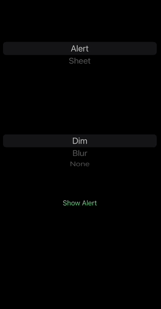
简单按钮对话框
public struct SimpleDialogueExample:View  {

    @Environment(\.colorScheme) var colorScheme
    @State var show: Bool = false
    @State var dialogueBoxType: DialogueType = .alert
    @State var backgroundEffect: BackgroundEffect = .dim

    @State var items: [OptionItem] = [OptionItem(title: "Edit", subtitle: nil, image: Image(systemName: "pencil.circle"),  shouldDismiss: true, enabled: true, triggerHandler: nil),
          OptionItem(title: "Share", subtitle: "..with everyone", image: Image(systemName: "square.and.arrow.up"),  shouldDismiss: true, enabled: true, triggerHandler: nil),
          OptionItem(title: "Cancel", subtitle: nil, image: nil, tintColor: .red, shouldDismiss: true, enabled: true, triggerHandler: nil)
         ]

    public init() {

    }


    public var body: some View {

        GeometryReader { proxy in
            VStack {
                VStack {
                    Picker(selection: $dialogueBoxType, label: Text("Dialogue Type")) {
                        Text("Alert").tag(DialogueType.alert)
                        Text("Sheet").tag(DialogueType.sheet)
                    }.pickerStyle(WheelPickerStyle())

                    Picker(selection: $backgroundEffect, label: Text("Background Effect")) {
                        Text("Dim").tag(BackgroundEffect.dim)
                        Text("Blur").tag(BackgroundEffect.blur)
                        Text("None").tag(BackgroundEffect.none)
                    }.pickerStyle(WheelPickerStyle())


                }
                Spacer()
                Divider()

                     Button(action: {
                         self.show = true
                     }) {
                         Text(self.dialogueBoxType == .alert ? "Show Alert" : "Show Sheet")
                     }.padding()


                Spacer()
            }
            .dialogueBox(type: dialogueBoxType, frameWidth: dialogueBoxType == .alert ?  min(proxy.size.width * 0.75, 300) : min(400, proxy.size.width),  settings: OptionDialogueSettings(backgroundEffect: backgroundEffect, boxShadow: shadow, dismissOnBackgroundTap: self.dialogueBoxType == .sheet), show: $show, header: {
                  OptionDialogueDefaultHeader(title: "Simple Dialogue", message: "Choose an option")
            }) {

               dialogueBoxContent()

            }

        }
    }

    public var shadow: Shadow {
        let color = colorScheme == .light ? Color.gray.opacity(0.4) : Color.clear
        let offsetX: CGFloat = self.dialogueBoxType == .alert ? -5 : 0
        return Shadow(color: color, radius: 5, x: offsetX, y: -5)

    }

    // add included button or create your own
    @ViewBuilder func dialogueBoxContent()->some View {

            ForEach(items) { item in

                OptionButton(title: item.title, subtitle: item.subtitle, accentColor: item.tintColor, image: item.image,  triggerHandler: item.triggerHandler, shouldDismiss: item.shouldDismiss, enabled:  .constant(item.enabled), show: $show)

            }


    }


}
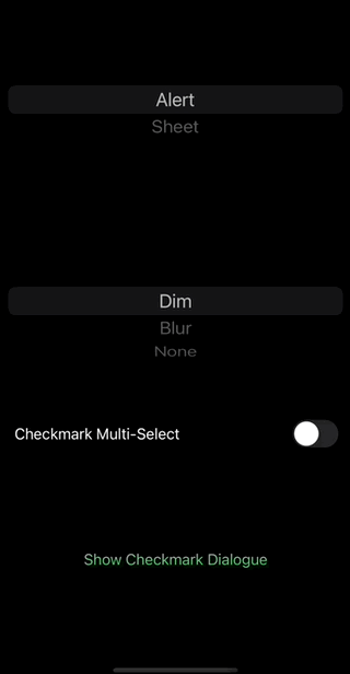
Checkmark dialogue box
public struct CheckmarkExample:View  {
    @Environment(\.colorScheme) var colorScheme
    @StateObject  var viewModel = CheckmarkItemsViewModel()  // check out the example project for details

   public init() {}

    public var body: some View {

        GeometryReader { proxy in
            VStack {
                VStack {
                    Picker(selection: $viewModel.dialogueBoxType, label: Text("Dialogue Type")) {
                        Text("Alert").tag(DialogueType.alert)
                        Text("Sheet").tag(DialogueType.sheet)
                    }.pickerStyle(WheelPickerStyle())

                    Picker(selection: $viewModel.backgroundEffect, label: Text("Background Effect")) {
                        Text("Dim").tag(BackgroundEffect.dim)
                        Text("Blur").tag(BackgroundEffect.blur)
                        Text("None").tag(BackgroundEffect.none)
                    }.pickerStyle(WheelPickerStyle())

                    Toggle("Checkmark Multi-Select", isOn: $viewModel.multiSelect).padding()

                }
                Spacer()
                Divider()

                    Button(action: {
                        self.viewModel.showCheckmarkDialogue = true
                    }) {
                        Text("Show Checkmark Dialogue")
                    }.padding()

                Spacer()
            }

            .dialogueBox(type: viewModel.dialogueBoxType, frameWidth: viewModel.dialogueBoxType == .alert ?  min(proxy.size.width * 0.75, 300) : min(400, proxy.size.width),  settings: OptionDialogueSettings(backgroundEffect: viewModel.backgroundEffect, boxShadow: shadow, dismissOnBackgroundTap: self.viewModel.dialogueBoxType == .sheet), show: $viewModel.showCheckmarkDialogue, header: {
                OptionDialogueDefaultHeader(title: "Checkmark Dialogue", message: "Select at least one option")
            }) {

                dialogueBoxContent


            }
            .onChange(of: self.viewModel.multiSelect) { _ in
                self.viewModel.createCheckmarkItems()
            }


        }

    }

    var shadow: Shadow {
        let color = colorScheme == .light ? Color.gray.opacity(0.4) : Color.clear
        let offsetX: CGFloat = self.viewModel.dialogueBoxType == .alert ? -5 : 0
        return Shadow(color: color, radius: 5, x: offsetX, y: -5)

    }

    @ViewBuilder public var dialogueBoxContent: some View {

        ForEach(viewModel.checkmarkItems) { item in

            CheckmarkButton(checkmarkItem: item, allCheckmarkItems: self.viewModel.checkmarkItems, show:  $viewModel.showCheckmarkDialogue, multiSelect: viewModel.multiSelect) {
                self.viewModel.updateMultiSelectOKButtonState()
            }

        }
        if viewModel.multiSelect {
            OptionButton(title: "OK", subtitle: nil, image: nil , triggerHandler: nil, shouldDismiss: true, enabled: $viewModel.multiSelectOKButtonEnabled, show: $viewModel.showCheckmarkDialogue)


            OptionButton(title: "Cancel", subtitle: nil, accentColor: .red, image: nil,  triggerHandler: nil, shouldDismiss: true, enabled: .constant(true), show: $viewModel.showCheckmarkDialogue)

        }


    }


}
Change log
Version 0.1.1
Minor improvements: Added bottom area inset padding underneath the buttons of a sheet. triggerHandler is now the last parameter of OptionButton initialiser.
Version 0.1
Initial public release.
Author
License
SwiftUIGraphs is available under the MIT license. See the LICENSE file for more info.